My Role
UI/UX Design
Visual Design
Brand Identity
Web Design
Creative Direction
Prototyping
Visual Storytelling
Period
2024 – Present
Sunnyvale, CA
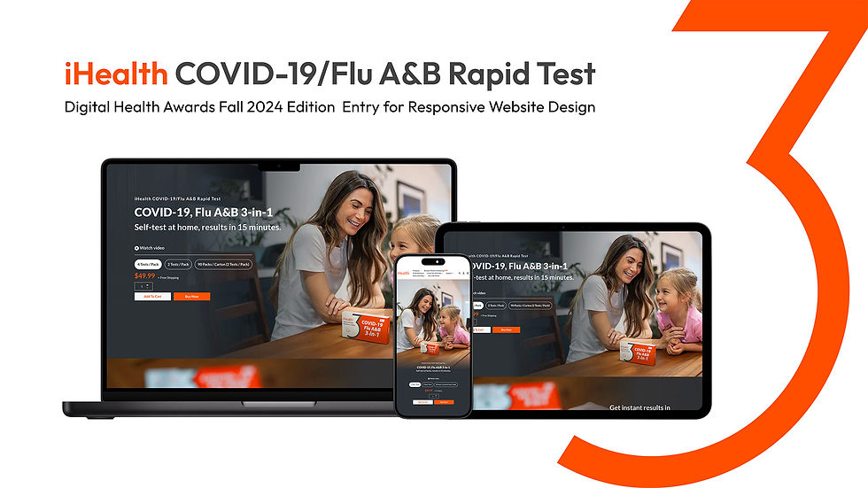
iHealth is a global health technology company focused on accessible, at-home medical devices across diagnostics, monitoring, and preventive care. I worked on product webpages and commercial campaigns, presenting regulated medical products with clarity, trust, and conversion in mind across web and Amazon.

My Role
UI/UX Design
Visual Design
Brand Identity
Web Design
Period
2024 – Present
Sunnyvale, CA

A condensed view of the landing page highlights three high-impact sections where interaction design improves clarity and reduces friction.

Icons were redesigned to clearly communicate COVID-19, Flu A, Flu B, and negative outcomes, reducing confusion at a critical decision point.

Instructional content was reorganized into card-based steps, making the process easier to follow and less intimidating.

Expandable questions replace dense text, minimizing scroll length while keeping detailed information accessible when needed.
Interaction Design
Web Experience Optimization
This section shows how interaction design principles extend beyond the app to improve clarity and decision making on the product landing page. Instead of redesigning the entire experience, the focus was placed on moments where users tend to hesitate or feel overwhelmed.
By simplifying result interpretation, restructuring testing steps, and turning long form FAQs into scannable interactions, the page reduces cognitive load and unnecessary scrolling. This helps users quickly understand what the test does, how to use it, and what the results mean.
My Responsibility.
I was responsible for designing new product webpages and commercial campaign assets at iHealth, supporting frequent launches and high-traffic sales moments across web and Amazon.
How I Contributed.
I worked closely with sales, marketing, and product teams through weekly planning discussions, translating business campaign and product direction into clear visual hierarchies, mobile-first layouts, and reusable UI systems.
Impact & Focus.
My focus was on improving clarity and conversion for regulated medical products ensuring users could quickly understand value, trust the product, and make confident decisions, even during time-sensitive promotions.
Interaction Design
Web Experience Optimization
This section shows how interaction design principles extend beyond the app to improve clarity and decision making on the product landing page. Instead of redesigning the entire experience, the focus was placed on moments where users tend to hesitate or feel overwhelmed.
By simplifying result interpretation, restructuring testing steps, and turning long form FAQs into scannable interactions, the page reduces cognitive load and unnecessary scrolling. This helps users quickly understand what the test does, how to use it, and what the results mean.
A condensed view of the landing page highlights three high-impact sections where interaction design improves clarity and reduces friction.
Icons were redesigned to clearly communicate COVID-19, Flu A, Flu B, and negative outcomes, reducing confusion at a critical decision point.
Instructional content was reorganized into card-based steps, making the process easier to follow and less intimidating.
Expandable questions replace dense text, minimizing scroll length while keeping detailed information accessible when needed.

Established a cohesive visual system that improved clarity, readability, and overall page structure across touchpoints.

Heatmap insights revealed stronger right-side interaction, informing mobile layout adjustments and action placement.

Conversion was treated as a journey, extending beyond the page through timely post-dropoff communication.
Outcomes & Impact
Measured Impact
Impact was measured through analytics, behavior tracking, and post-dropoff performance.
The updated structure improved engagement clarity, revealed actionable interaction patterns, and contributed to higher recovery from abandoned purchase flows.
Outcomes & Impact
In Practice
The redesign demonstrated how visual clarity, motion restraint, and layout hierarchy can shift audience perception without alienating existing users.
By simplifying interactions and softening the visual tone, the product became more approachable to younger users while preserving confidence and usability across age groups.

Post-launch data showed a noticeable shift toward younger users, suggesting stronger resonance with a new audience segment.
My Responsibility.
I was responsible for designing new product webpages and commercial campaign assets at iHealth, supporting frequent launches and high-traffic sales moments across web and Amazon.
How I Contributed.
I worked closely with sales, marketing, and product teams through weekly planning discussions, translating business campaign and product direction into clear visual hierarchies, mobile-first layouts, and reusable UI systems.
Impact & Focus.
My focus was on improving clarity and conversion for regulated medical products ensuring users could quickly understand value, trust the product, and make confident decisions, even during time-sensitive promotions.
Design Approach
My approach at iHealth emphasized clarity, speed, and scalability, using familiar patterns and modular systems to support fast-moving launches while maintaining trust and consistency.
Learnings
This work reinforced the importance of designing for confidence rather than adding features. By focusing on clarity, visual hierarchy, and decision-critical moments, the experience shifted from requiring users to actively figure things out to quietly guiding them forward.
A key learning was that meaningful improvements do not always come from redesigning entire systems. Targeted changes to high-friction areas can significantly reduce cognitive load and help users feel informed and in control, even in time-sensitive or stressful situations.

Established a cohesive visual language that aligned marketing, product, and brand touchpoints under a single system.
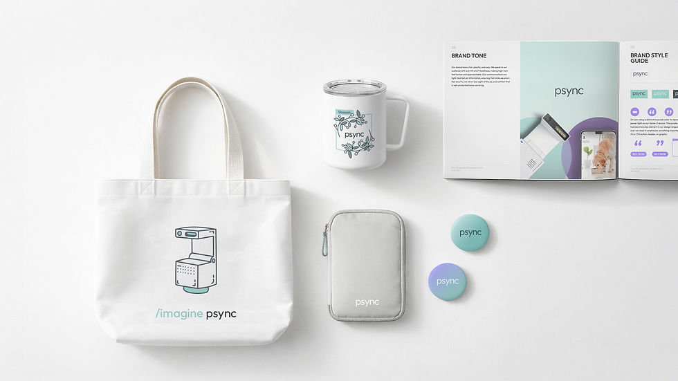
Visual elements scale easily across channels, creating a cohesive presence for the brand.
The visual language extends naturally into marketing touchpoints, keeping the brand clear and approachable across formats. Soft lighting, clean layouts, and subtle color accents create a consistent tone that feels modern and warm. Each piece, from packaging to promotional graphics, reinforces the same sense of clarity and simplicity found in the core product experience.
Outcomes & Impact
Trust in Healthcare
To support iHealth’s healthcare products, I focused on designing experiences that feel clear, calm, and trustworthy. The goal was to present medical information in a way that is easy to understand, approachable, and reassuring for everyday users.
With a broad audience that includes families and older adults, the design needed to be instantly scannable and low-friction. These principles guided decisions across layout, hierarchy, spacing, and iconography to help users quickly understand information and feel confident using the product.
Reliability
Connected Care
Human-Centered
Trust
Hero banners
Landing page sections
Mobile App
Social media posts
Email banners
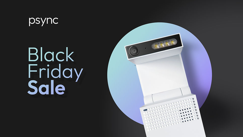
Hero banners use soft lighting, balanced spacing, and clean compositions to present the product with confidence and warmth. The visual tone is calm and minimal, giving the product room to stand out.
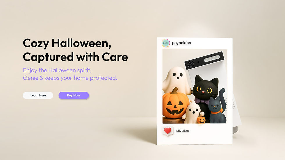
A calm, spacious layout that highlights the product's form and presence.
Visual System
The visual system defines a clear, warm, and modern look for the brand. Each asset, from hero banners to social posts, follows a consistent rhythm in color, composition, and typography, creating a cohesive presence across all touchpoints.


Hero banners
Landing page sections
Mobile App
Social media posts
Email banners
Hero banners use soft lighting, balanced spacing, and clean compositions to present the product with confidence and warmth. The visual tone is calm and minimal, giving the product room to stand out.
Reliability
Trust
Connected Care
Human-Centered
Trust in Healthcare
To support iHealth’s healthcare products, I focused on designing experiences that feel clear, calm, and trustworthy. The goal was to present medical information in a way that is easy to understand, approachable, and reassuring for everyday users.
With a broad audience that includes families and older adults, the design needed to be instantly scannable and low-friction. These principles guided decisions across layout, hierarchy, spacing, and iconography to help users quickly understand information and feel confident using the product.

Beyond Digital.
This work explores how iHealth products fit into everyday life. A consistent experience across packaging, devices, and the app helps health tools feel approachable and reassuring.

Thoughtful & Safe.
Soft tones, balanced spacing, and subtle interactions help the camera feel calm and approachable rather than technical or intimidating.

Calm & Precise.
Blood glucose monitoring is designed to feel calm, precise, and reassuring, supported by a clear app interface that helps users understand their data with confidence.

User-Centered.
A unified visual rhythm across products, components, and details helps users recognize patterns and feel oriented across the system.
Beyond Digital.
This work explores how iHealth products fit into everyday life. A consistent experience across packaging, devices, and the app helps health tools feel approachable and reassuring.
Thoughtful & Safe.
Soft tones, balanced spacing, and subtle interactions help the experience feel calm and approachable rather than clinical or intimidating.
Calm & Precise.
Blood glucose monitoring is designed to feel calm, precise, and reassuring, supported by a clear app interface that helps users understand their data with confidence.
One Unified System.
A unified visual rhythm across products, components, and details helps users recognize patterns and feel oriented across the system.
Hero banners
Landing page sections
Mobile App
Social media posts
Email banners
Hero banners use soft lighting, balanced spacing, and clean compositions to present the product with confidence and warmth. The visual tone is calm and minimal, giving the product room to stand out.
A calm, spacious layout that highlights the product's form and presence.
Visual System
The visual system defines a clear, warm, and modern look for the brand. Each asset, from hero banners to social posts, follows a consistent rhythm in color, composition, and typography, creating a cohesive presence across all touchpoints.
Visual System
The visual system is built around a small set of recognizable elements, from clear iconography to restrained typography and a neutral palette led by iHealth’s signature orange. Together, these decisions support trust and clarity across medical products through structure, consistency, and white space.


A hero banner built around a clean product family composition, balancing promotional messaging with a calm, trustworthy tone.

Responsive landing page sections designed to maintain visual hierarchy and clarity across desktop, tablet, and mobile screens.

App interface focused on readability and ease of use, helping users understand health data through clear, consistent patterns.

Social media visuals adapted from the core system, optimized for quick recognition and consistent brand presence across feed-based formats.

Email banner designs that extend the visual system into direct communication, using restrained layouts to keep messages clear and approachable.
Hero banners
Landing page sections
Mobile App
Social media posts
Email banners
These deliverables show how the iHealth visual system is applied consistently across key touchpoints, from web and mobile to social and email, while maintaining clarity and brand recognition.
Visual System
The visual system is built around a small set of recognizable elements, from clear iconography to restrained typography and a neutral palette led by iHealth’s signature orange. Together, these decisions support trust and clarity across medical products through structure, consistency, and white space.
Hero banners
Landing page sections
Mobile App
Social media posts
Email banners
These deliverables show how the iHealth visual system is applied consistently across key touchpoints, from web and mobile to social and email, while maintaining clarity and brand recognition.
A hero banner built around a clean product family composition, balancing promotional messaging with a calm, trustworthy tone.
Responsive landing page sections designed to maintain visual hierarchy and clarity across desktop, tablet, and mobile screens.
App interface focused on readability and ease of use, helping users understand health data through clear, consistent patterns.
Social media visuals adapted from the core system, optimized for quick recognition and consistent brand presence across feed-based formats.
Email banner designs that extend the visual system into direct communication, using restrained layouts to keep messages clear and approachable.

Homepage flow — Entry

Homepage flow — Understanding

Homepage flow — Decision
Interaction Design
User Flow
The user flow shows how the landing page guides users through key stages of understanding and decision-making. Clear structure, simple labels, and familiar patterns help users move from awareness to confidence in a calm and predictable way.
By breaking the journey into focused phases, the layout helps users understand what the product does and why it can be trusted before making a decision.
Homepage flow — Entry
Homepage flow — Understanding
Homepage flow — Decision
Interaction Design
User Flow
The user flow shows how the landing page guides users through key stages of understanding and decision-making. Clear structure, simple labels, and familiar patterns help users move from awareness to confidence in a calm and predictable way.
By breaking the journey into focused phases, the layout helps users understand what the product does and why it can be trusted before making a decision.
Interaction Design
App Experience
This section presents the end-to-end interaction design of the iHealth Gluco-Smart app, showing how users move from initial setup to measurement, and from results to long-term tracking. The experience focuses on reducing friction during key moments such as device pairing, completing a test, and understanding blood glucose readings.
Clear flows, familiar patterns, and consistent feedback gradually introduce trends, history, and reminders, helping users build confidence and turn individual measurements into a reliable daily health routine.

A high-level view of the Gluco-Smart app, showing the core dashboard alongside the end-to-end user flow from setup to tracking.

Onboarding and device setup are mapped into a clear flow, covering account creation, Bluetooth pairing, and guided measurement steps.

A closer look at the setup flow, where each step uses familiar patterns and simple prompts to make pairing and first-time use feel effortless.

The measurement journey is broken into small, sequential actions, leading users from inserting the test strip to viewing results with clear feedback.

After results are displayed, the experience expands into long-term support, including trends, history, learning content, and reminder settings.

A snapshot of key screens across the app, highlighting how consistent layout and visual feedback connect setup, measurement, and daily tracking.
A high-level view of the Gluco-Smart app, showing the core dashboard alongside the end-to-end user flow from setup to tracking.
Onboarding and device setup are mapped into a clear flow, covering account creation, Bluetooth pairing, and guided measurement steps.
A closer look at the setup flow, where each step uses familiar patterns and simple prompts to make pairing and first-time use feel effortless.
The measurement journey is broken into small, sequential actions, leading users from inserting the test strip to viewing results with clear feedback.
After results are displayed, the experience expands into long-term support, including trends, history, learning content, and reminder settings.
A snapshot of key screens across the app, highlighting how consistent layout and visual feedback connect setup, measurement, and daily tracking.
Interaction Design
App Experience
This section presents the end-to-end interaction design of the iHealth Gluco-Smart app, showing how users move from initial setup to measurement, and from results to long-term tracking. The experience focuses on reducing friction during key moments such as device pairing, completing a test, and understanding blood glucose readings.
Clear flows, familiar patterns, and consistent feedback gradually introduce trends, history, and reminders, helping users build confidence and turn individual measurements into a reliable daily health routine.