My Role
UI/UX Design
Visual Design
Brand Identity
Web Design
Creative Direction
Prototyping
Visual Storytelling
Period
2021 – 2024
San Jose, CA
VAVA designs consumer electronics that balance functionality, simplicity, and everyday usability.
I worked across product design, visual systems, and marketing experiences, contributing to connected hardware products and their supporting digital touchpoints.

Coming Soon
This project is currently being refined.
The full case study will be available shortly.
This project is currently being refined.
The full case study will be available shortly.
Coming Soon
VAVA designs consumer electronics that balance functionality, simplicity, and everyday usability.
I worked across product design, visual systems, and marketing experiences, contributing to connected hardware products and their supporting digital touchpoints.
My Role
UI/UX Design
Visual Design
Brand Identity
Web Design
Period
2021 – 2024
San Jose, CA
Problem.
Mobile phones and basic cameras struggle to provide reliable, always-on visibility. Users often miss important moments or have to take extra steps to check what’s happening at home. This leads to uncertainty around deliveries, pets, and everyday safety.
Define the problem.
Users want feedback that feels meaningful, not generic motion alerts. They need clarity about what happened, who is involved, and whether things are normal. Without this context, it becomes difficult to act quickly, especially when they are away from home.
What if.....?
What if a home camera could understand meaningful moments, recognize context, and help people stay connected with their homes in a calm and reassuring way? And what if it did all of this while respecting privacy at every step?

Visual elements scale easily across channels, creating a cohesive presence for the brand.
Visual elements scale easily across channels, creating a cohesive presence for the brand.
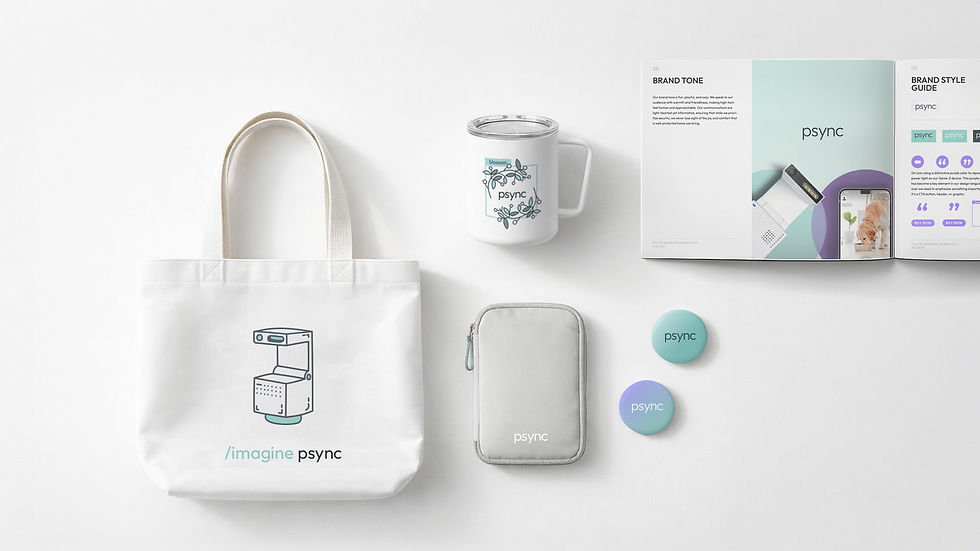
Brand Extension
Marketing Materials
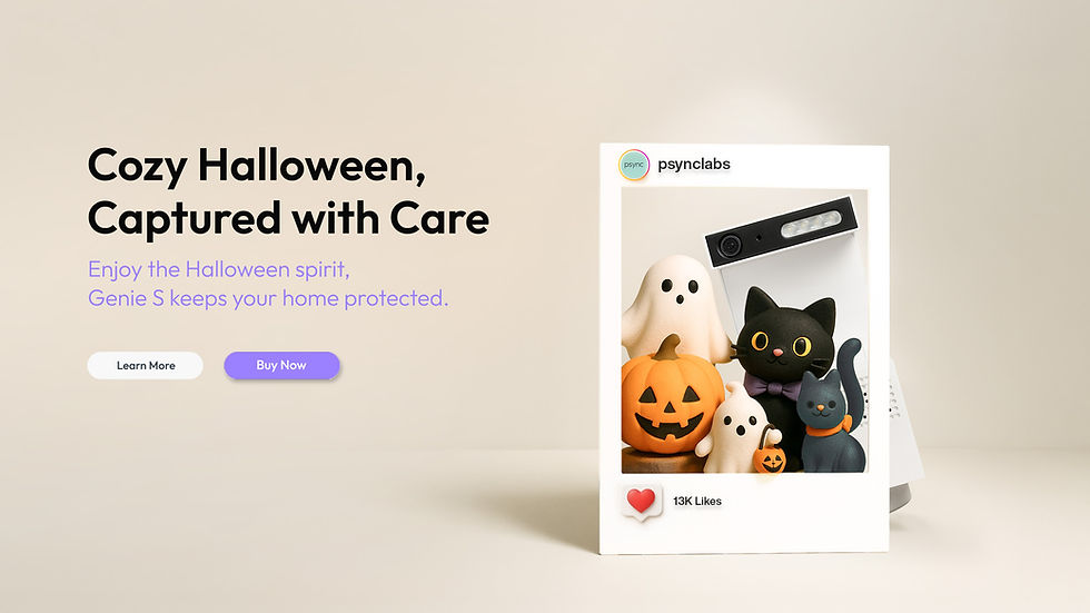
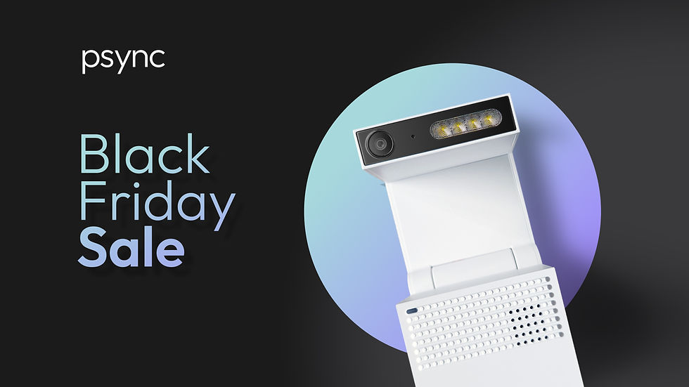
The visual language extends naturally into marketing touchpoints, keeping the brand clear and approachable across formats. Soft lighting, clean layouts, and subtle color accents create a consistent tone that feels modern and warm. Each piece, from packaging to promotional graphics, reinforces the same sense of clarity and simplicity found in the core product experience.
Visual System
The visual system defines a clear, warm, and modern look for the brand. Each asset, from hero banners to social posts, follows a consistent rhythm in color, composition, and typography, creating a cohesive presence across all touchpoints.


Hero banners
Landing page sections
Mobile App
Social media posts
Email banners
Hero banners use soft lighting, balanced spacing, and clean compositions to present the product with confidence and warmth. The visual tone is calm and minimal, giving the product room to stand out.
Problem.
Mobile phones and basic cameras struggle to provide reliable, always-on visibility. Users often miss important moments or have to take extra steps to check what’s happening at home. This leads to uncertainty around deliveries, pets, and everyday safety.
Define the problem.
Users want feedback that feels meaningful, not generic motion alerts. They need clarity about what happened, who is involved, and whether things are normal. Without this context, it becomes difficult to act quickly, especially when they are away from home.
What if.....?
What if a home camera could understand meaningful moments, recognize context, and help people stay connected with their homes in a calm and reassuring way? And what if it did all of this while respecting privacy at every step?
User Insight
From Google Analytics, we learned that our most engaged users were 35–64, while younger visitors dropped off quickly. This revealed that our original layout wasn’t scannable enough for our core audience and guided the structure of the redesign.
Design Approach
My approach to Genie-S focused on making an intelligent product feel calm, approachable, and part of everyday life. I began by understanding how people actually use home cameras: checking deliveries, staying connected with pets, and making sure their families are safe. From these real scenarios, I shaped a visual and interaction language that feels softer, more human, and comfortable to understand at a glance. Every detail, from spacing to color to motion, was designed to reduce cognitive load and help users feel guided rather than overwhelmed. The result is a clearer, more intuitive experience that supports trust and ease in everyday moments.
Visual elements scale easily across channels, creating a cohesive presence for the brand.
Visual elements scale easily across channels, creating a cohesive presence for the brand.
Brand Extension
Marketing Materials
The visual language extends naturally into marketing touchpoints, keeping the brand clear and approachable across formats. Soft lighting, clean layouts, and subtle color accents create a consistent tone that feels modern and warm. Each piece, from packaging to promotional graphics, reinforces the same sense of clarity and simplicity found in the core product experience.
Design Principles
To rebuild Psync’s visual identity, I focused on creating a system that feels clear, warm, and genuinely helpful in everyday life. The aim was to move away from an outdated, overly technical look and toward something more approachable and trustworthy. With a core audience aged 35–64 and high drop-off rates on key pages, the redesign also needed to be instantly scannable and low-friction. These principles shaped decisions across typography, spacing, motion, and layout to create a calmer, more intuitive experience.
Innovation
User Center
Simplicity
Trust
Playfulness
Innovation
User Center
Simplicity
Trust
Playfulness
Design Principles
To rebuild Psync’s visual identity, I focused on creating a system that feels clear, warm, and genuinely helpful in everyday life. The aim was to move away from an outdated, overly technical look and toward something more approachable and trustworthy. With a core audience aged 35–64 and high drop-off rates on key pages, the redesign also needed to be instantly scannable and low-friction. These principles shaped decisions across typography, spacing, motion, and layout to create a calmer, more intuitive experience.

Clarity.
A refined visual hierarchy, balanced spacing, and simplified components make information easy to read and understand at a glance.

Warm & Trustworthy.
Soft tones, balanced spacing, and subtle interactions help the camera feel calm and approachable rather than technical or intimidating.

Consistency.
A unified visual rhythm across typography, components, and spacing helps users recognize patterns and predict interactions.

User-Centered.
Real usage scenarios such as deliveries, pet monitoring, and travel informed the hierarchy, tone, and motion, ensuring the experience feels natural in everyday life.

Established a cohesive visual system that improved clarity, readability, and overall page structure across touchpoints.

Heatmap insights revealed stronger right-side interaction, informing mobile layout adjustments and action placement.

Conversion was treated as a journey, extending beyond the page through timely post-dropoff communication.
Outcomes & Impact
Measured Impact
Impact was measured through analytics, behavior tracking, and post-dropoff performance.
The updated structure improved engagement clarity, revealed actionable interaction patterns, and contributed to higher recovery from abandoned purchase flows.
Outcomes & Impact
In Practice
The redesign demonstrated how visual clarity, motion restraint, and layout hierarchy can shift audience perception without alienating existing users.
By simplifying interactions and softening the visual tone, the product became more approachable to younger users while preserving confidence and usability across age groups.

Post-launch data showed a noticeable shift toward younger users, suggesting stronger resonance with a new audience segment.
Clarity.
A refined visual hierarchy, balanced spacing, and simplified components make information easy to read and understand at a glance.
Warm & Trustworthy.
Soft tones, balanced spacing, and subtle interactions help the camera feel calm and approachable rather than technical or intimidating.
Consistency.
A unified visual rhythm across typography, components, and spacing helps users recognize patterns and predict interactions.
User-Centered.
Real usage scenarios such as deliveries, pet monitoring, and travel informed the hierarchy, tone, and motion, ensuring the experience feels natural in everyday life.
Established a cohesive visual system that improved clarity, readability, and overall page structure across touchpoints.
Heatmap insights revealed stronger right-side interaction, informing mobile layout adjustments and action placement.
Conversion was treated as a journey, extending beyond the page through timely post-dropoff communication.
Outcomes & Impact
Measured Impact
Impact was measured through analytics, behavior tracking, and post-dropoff performance.
The updated structure improved engagement clarity, revealed actionable interaction patterns, and contributed to higher recovery from abandoned purchase flows.
In Practice
The redesign demonstrated how visual clarity, motion restraint, and layout hierarchy can shift audience perception without alienating existing users.
By simplifying interactions and softening the visual tone, the product became more approachable to younger users while preserving confidence and usability across age groups.
Post-launch data showed a noticeable shift toward younger users, suggesting stronger resonance with a new audience segment.
Visual System
The visual system defines a clear, warm, and modern look for the brand. Each asset, from hero banners to social posts, follows a consistent rhythm in color, composition, and typography, creating a cohesive presence across all touchpoints.

Learnings
This project reinforced the importance of designing for confidence, not just features.
By reducing friction and clarifying visual hierarchy, the experience shifted from “checking in” to “always knowing,” helping users feel more in control of everyday moments.
The key learning was knowing when to simplify the interface so the system could work quietly in the background.
A calm, spacious layout that highlights the product's form and presence.
Modular landing page sections designed to structure information clearly and support conversion.
A task-focused mobile interface designed for intuitive navigation and everyday use.
Social visuals designed to communicate key messages quickly within fast-scrolling feeds.

Email banner designs created to deliver clear messaging while maintaining brand consistency.
Hero banners
Landing page sections
Mobile App
Social media posts
Email banners
Hero banners use soft lighting, balanced spacing, and clean compositions to present the product with confidence and warmth. The visual tone is calm and minimal, giving the product room to stand out.
Visual System
The visual system defines a clear, warm, and modern look for the brand. Each asset, from hero banners to social posts, follows a consistent rhythm in color, composition, and typography, creating a cohesive presence across all touchpoints.
Hero banners
Landing page sections
Mobile App
Social media posts
Email banners
Hero banners use soft lighting, balanced spacing, and clean compositions to present the product with confidence and warmth. The visual tone is calm and minimal, giving the product room to stand out.
A calm, spacious layout that highlights the product's form and presence.
Modular landing page sections designed to structure information clearly and support conversion.
A task-focused mobile interface designed for intuitive navigation and everyday use.
Social visuals designed to communicate key messages quickly within fast-scrolling feeds.
Email banner designs created to deliver clear messaging while maintaining brand consistency.
Learnings
This project reinforced the importance of designing for confidence, not just features.
By reducing friction and clarifying visual hierarchy, the experience shifted from “checking in” to “always knowing,” helping users feel more in control of everyday moments.
The key learning was knowing when to simplify the interface so the system could work quietly in the background.
Hero banners
Landing page sections
Mobile App
Social media posts
Email banners
Hero banners use soft lighting, balanced spacing, and clean compositions to present the product with confidence and warmth. The visual tone is calm and minimal, giving the product room to stand out.
A calm, spacious layout that highlights the product's form and presence.

Established a cohesive visual language that aligned marketing, product, and brand touchpoints under a single system.
Visual elements scale easily across channels, creating a cohesive presence for the brand.
The visual language extends naturally into marketing touchpoints, keeping the brand clear and approachable across formats. Soft lighting, clean layouts, and subtle color accents create a consistent tone that feels modern and warm. Each piece, from packaging to promotional graphics, reinforces the same sense of clarity and simplicity found in the core product experience.
Outcomes & Impact
Visual System
The visual system defines a clear, warm, and modern look for the brand. Each asset, from hero banners to social posts, follows a consistent rhythm in color, composition, and typography, creating a cohesive presence across all touchpoints.

A simple flow that keeps navigation light and easy to follow.

A clear flow that answers key questions before purchase.

A task-focused mobile interface designed for intuitive navigation and everyday use.
Interaction Design
User Flow
The user flow shows how the layout guides visitors through key sections of the homepage. Each step uses clear spacing, simple labels, and consistent components to help users understand where they are and where they can go next.
Sections like Hero, Best Seller, and Featured Logos create a smooth visual rhythm that leads naturally into the product page. The flow keeps the structure clean and predictable, making navigation feel light and easy to follow.
A simple flow that keeps navigation light and easy to follow.
A clear flow that answers key questions before purchase.
A task-focused mobile interface designed for intuitive navigation and everyday use.
Interaction Design
User Flow
The user flow shows how the layout guides visitors through key sections of the homepage. Each step uses clear spacing, simple labels, and consistent components to help users understand where they are and where they can go next.
Sections like Hero, Best Seller, and Featured Logos create a smooth visual rhythm that leads naturally into the product page. The flow keeps the structure clean and predictable, making navigation feel light and easy to follow.
Interaction Design
Page Transformation
This sequence shows the evolution from a basic wireframe to a refined product page. It highlights how layout, spacing, typography, and visual details work together to create a polished interface. Each step reveals how the design system shapes a clearer and more modern experience.

From wireframe to final layout, showing how structure, content, and visuals come together.
Hero banners
Landing page sections
Mobile App
Social media posts
Email banners
Hero banners use soft lighting, balanced spacing, and clean compositions to present the product with confidence and warmth. The visual tone is calm and minimal, giving the product room to stand out.
A calm, spacious layout that highlights the product's form and presence.

From wireframe to final layout, showing how structure, content, and visuals come together.
Interaction Design
Page Transformation
This sequence shows the evolution from a basic wireframe to a refined product page. It highlights how layout, spacing, typography, and visual details work together to create a polished interface. Each step reveals how the design system shapes a clearer and more modern experience.